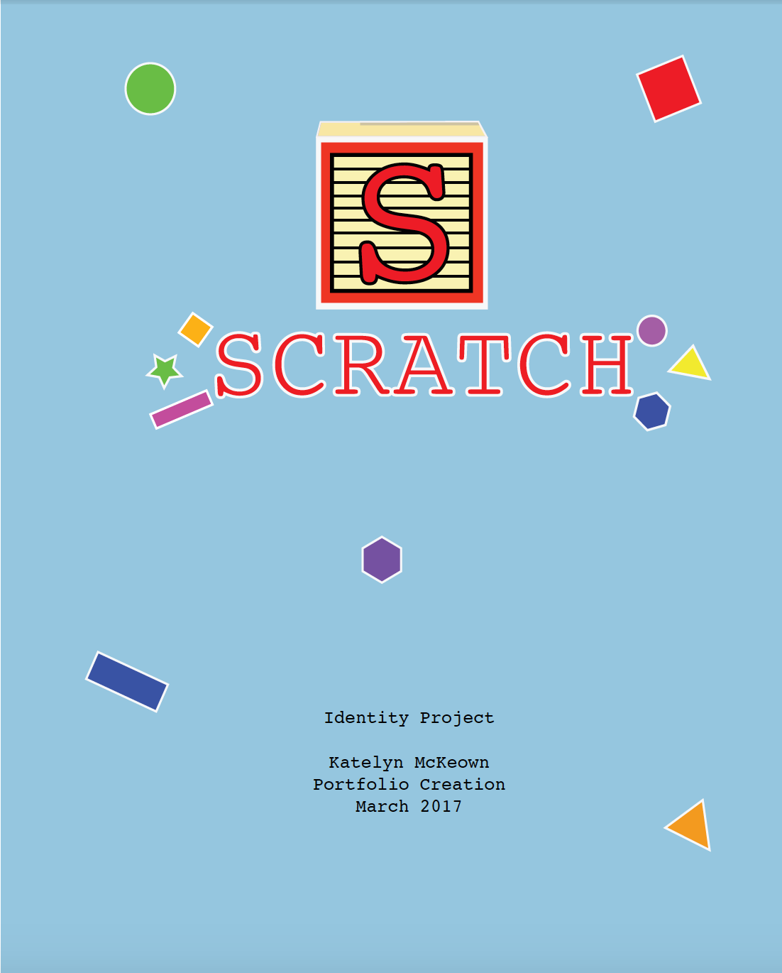
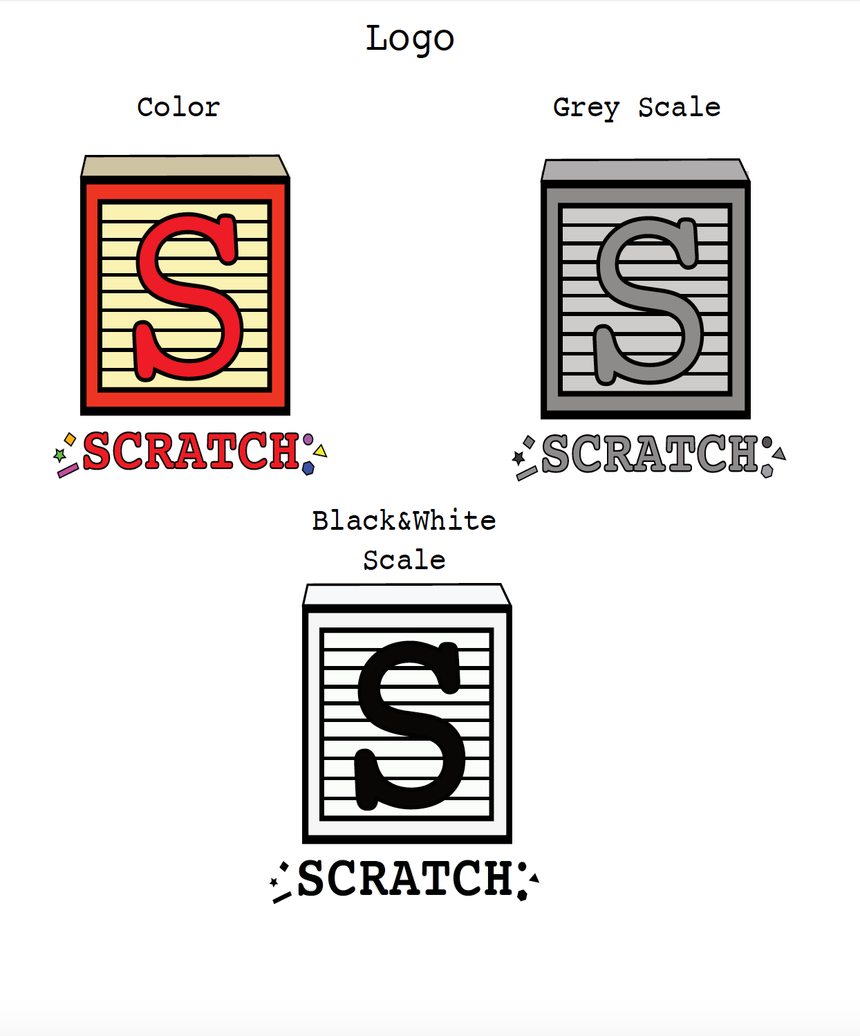
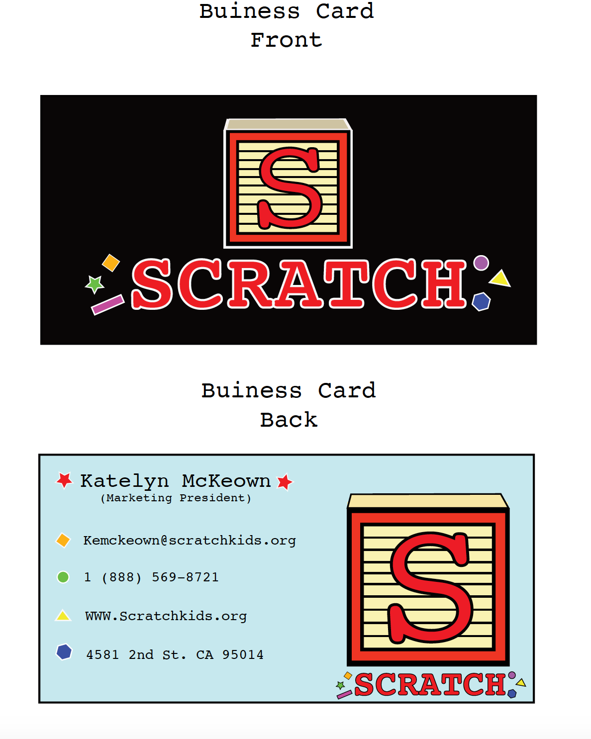
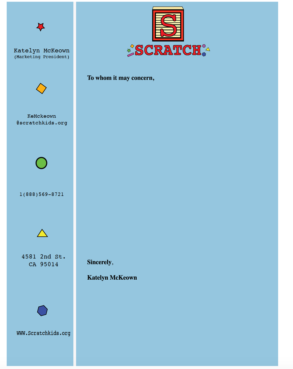

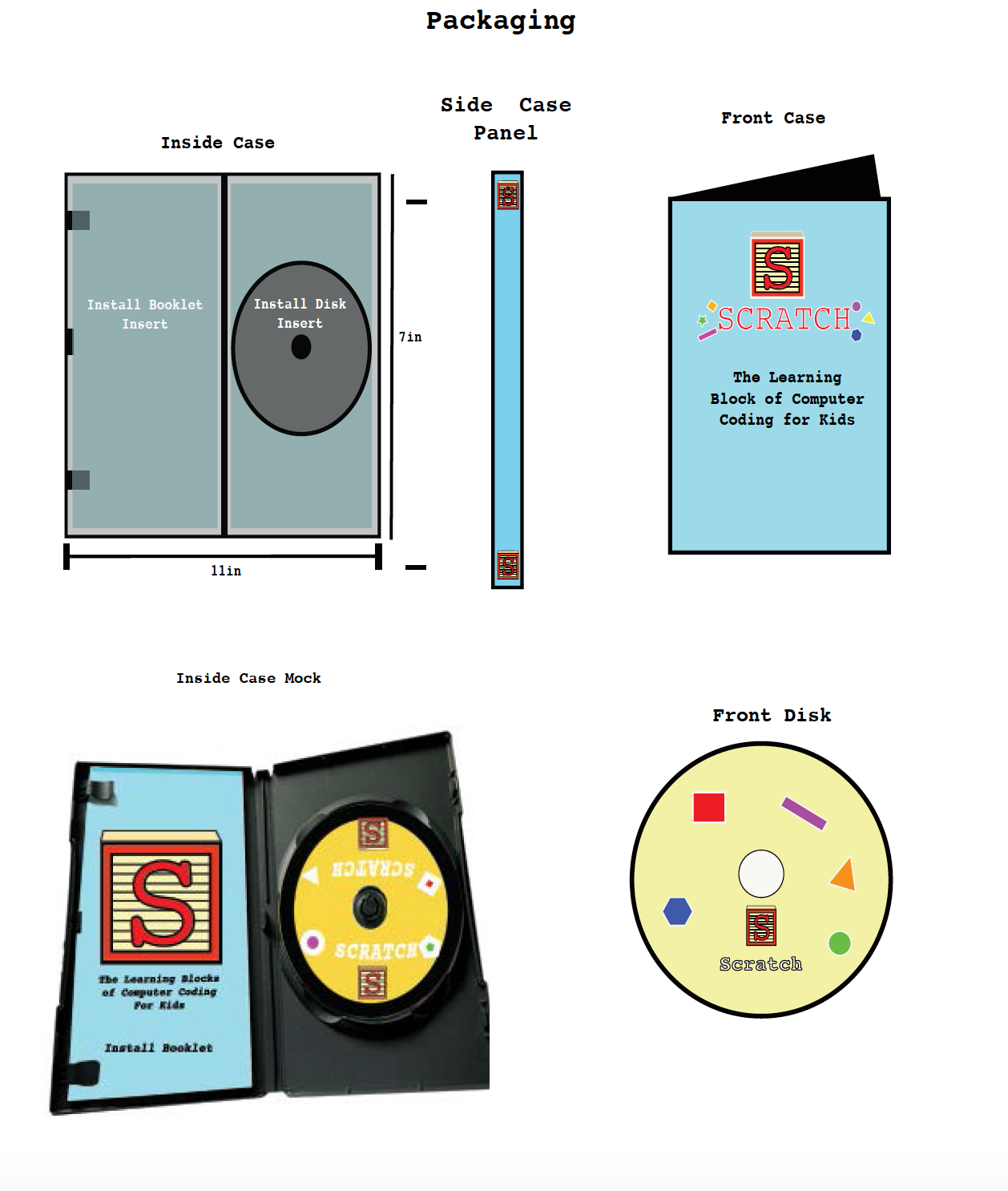

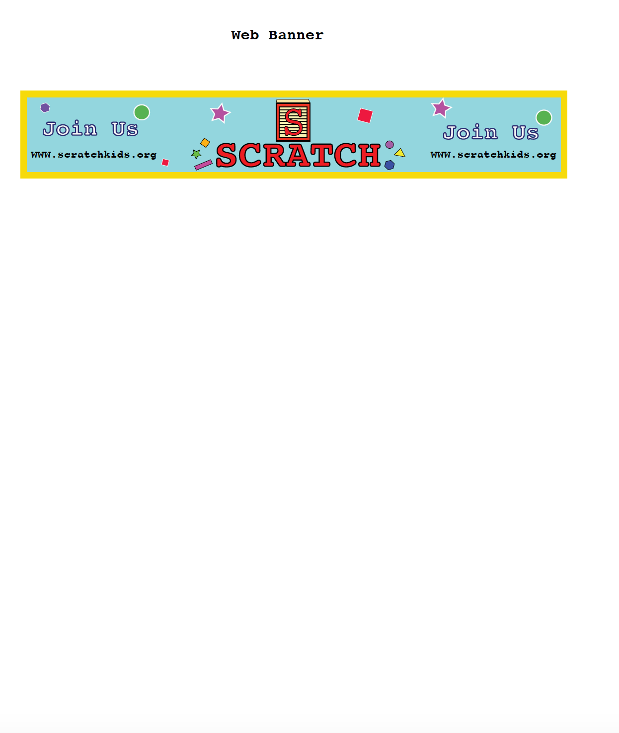
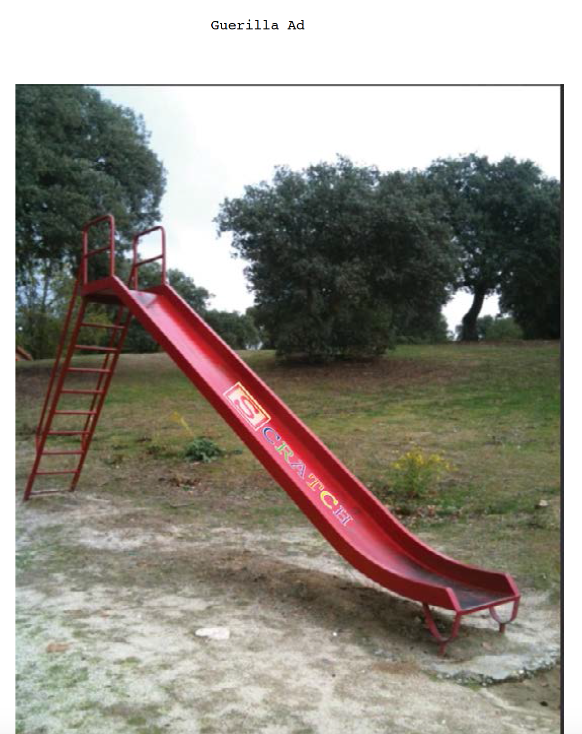
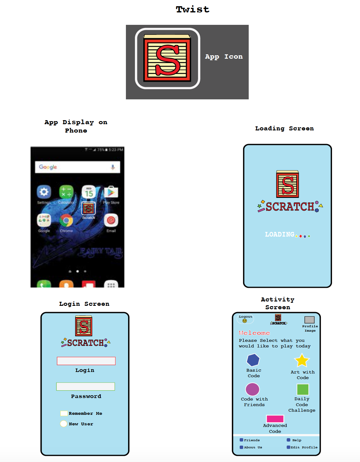
This is my design concept for Scratch. The second page displays the logo in different color scales, such as color, grey scale and black and white scale. The logo is a simple "S" however it is placed upon a building block and underneath is a playful take on the name with assorted shapes in-casing the name Scratch. On the third, fourth and fifth pages are my business card, letter head and envelope design. All keeping to the playful theme of fun shapes and child learning. The last pages are my packaging design, Guerrilla marketing, an AD, web banner and lastly a cellphone app. For the App I wanted to make it simple and easy to use since the target audience is children and fun bold colors help keep their attention when learning. Overall I wanted to capture the fun aspects of learning while still being able to present important information to the younger audience.